Located in the heart of Brussels, SUSSOL is a multidisciplinary creative agency specializing in audiovisual production and event services. I joined this family in November 2024, taking on multiple roles including graphic designer, artistic director, and creative director.
As a graphic designer, I create a wide range of visual content including graphic design, branding materials, logos, titles, album covers, animations, illustrations, and more.
In my role as an artistic director, I advise SUSSOL’s talents in the development of their projects—shaping their visual identity, communication strategies, and artistic direction.
As the creative director, I support SUSSOL’s crew members in bringing their own creative projects to life, fostering collaboration and innovation within the agency.
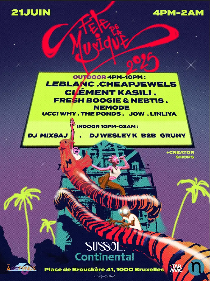
Some of the projects we collaborated on:
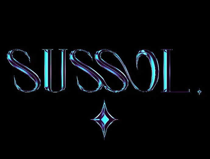
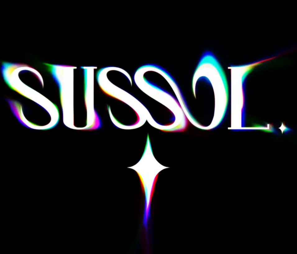
SUSSOL BRANDING
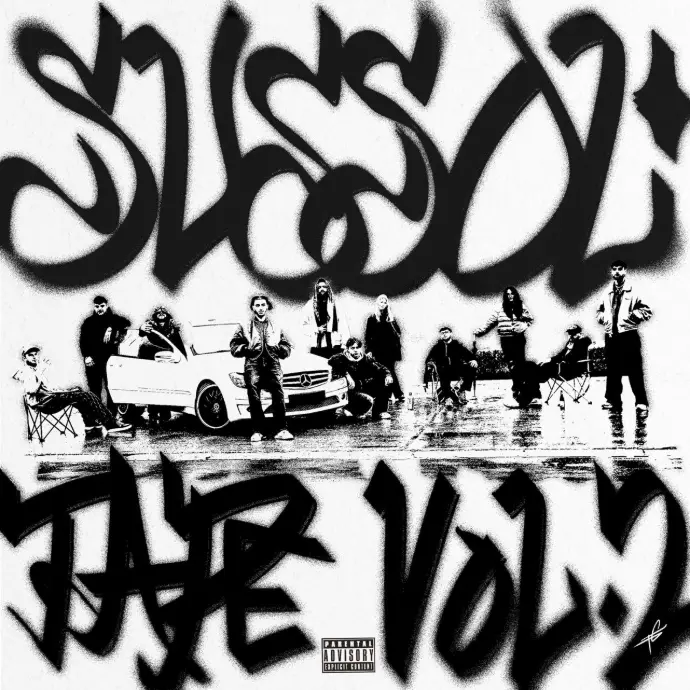
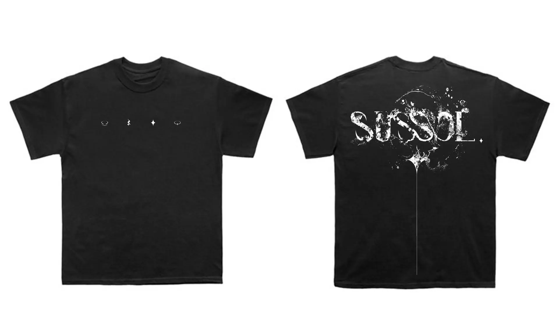
Merch
Merch Designed by Me.
Since Sussol was initially an audiovisual agency, I was inspired by the acid deformations during the picture developing process :
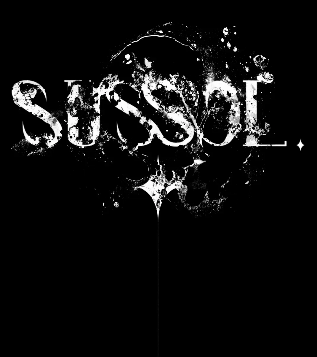
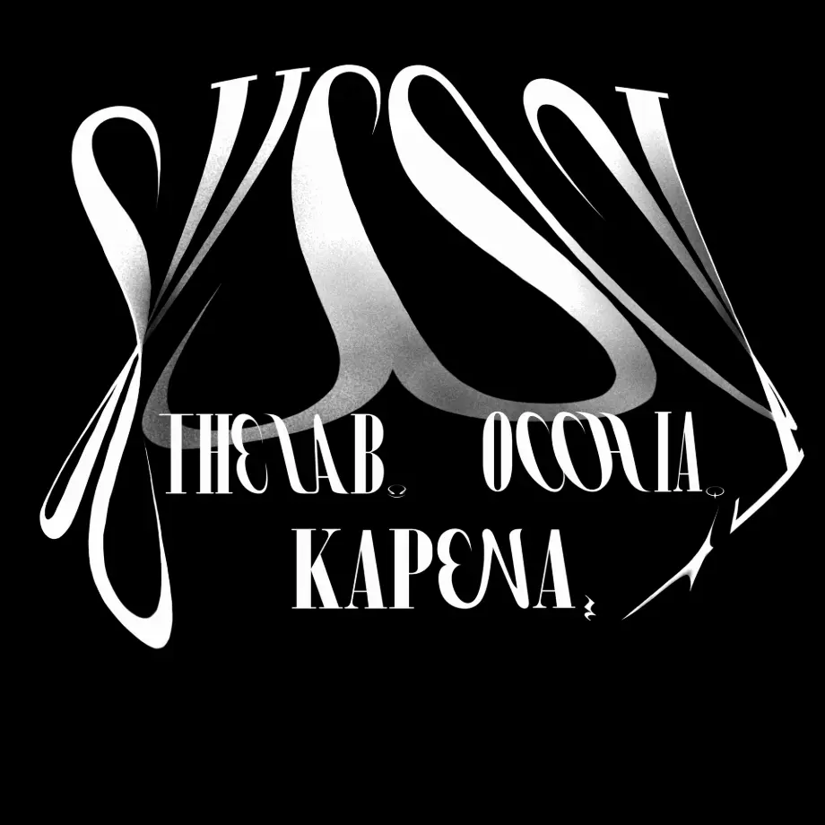
SUSSOL BRANDING
The Structure Explenation Design
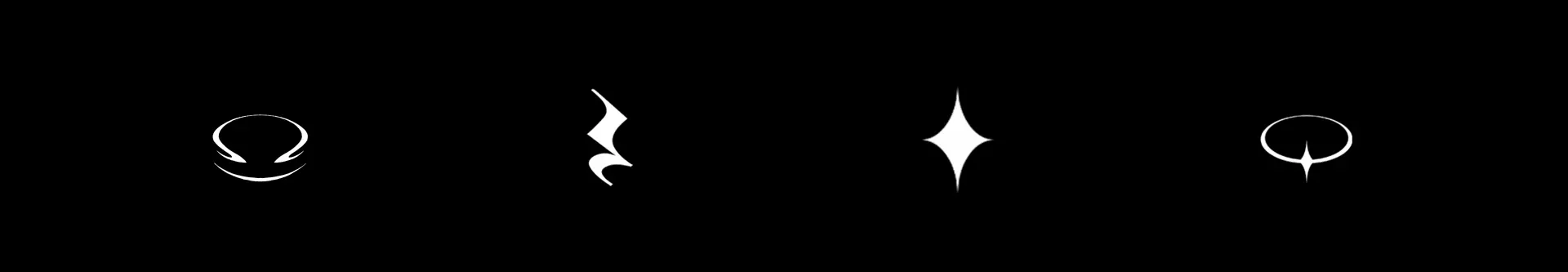
Sussol is a creative agency divided into three key sectors:
- Kapena for sound
( Sound design, Recording Studio, production,... ) - The Lab for events
( Concerts, exhibitions, Festivals,... ) - Occhia for visuals
( Videos, Graphic Designs, Clips,... )
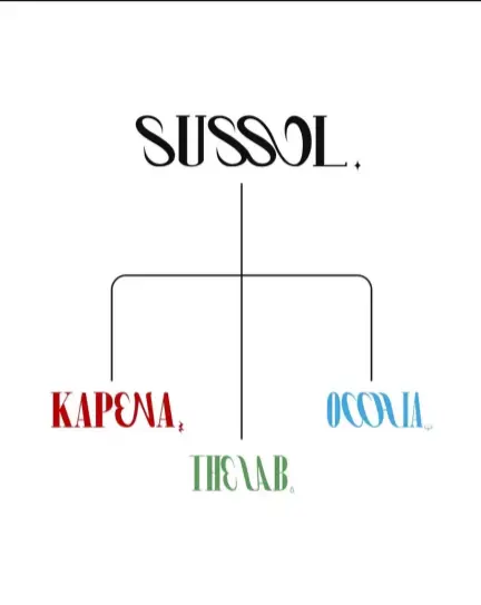
And I was I had the pleasure to reimagine a more eaesthetic way to replace the first one (above) explaning this organisation:
"The LAB" logo
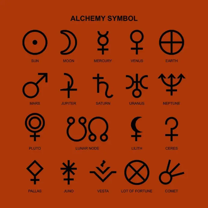

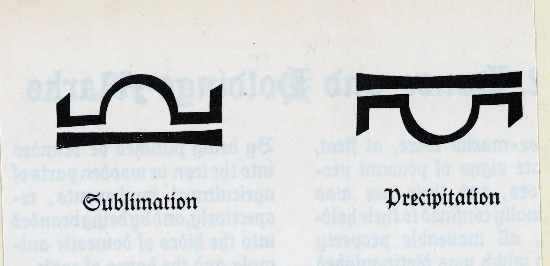
After our conversation, we decided to use alchemical symbols as a basis for designing the logo, aiming to reflect the essence of a laboratory. Through my research, I was drawn to the "Sublimation" symbol, as it embodies both a figurative meaning of enhancing beauty and a scientific interpretation of converting a solid into vapor, enabling it to be liberated and travel.
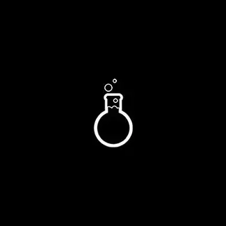
Each branch has his own logo additionnally to the main one, and I had the chance to reimgine "The Lab" ' s pictogram.
Symbolism
Here are my first explorations into the redesign of the Sublimation symbol:
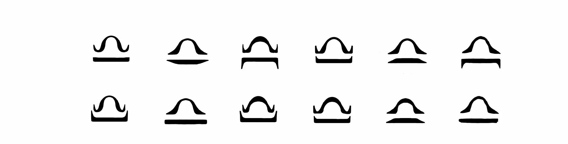
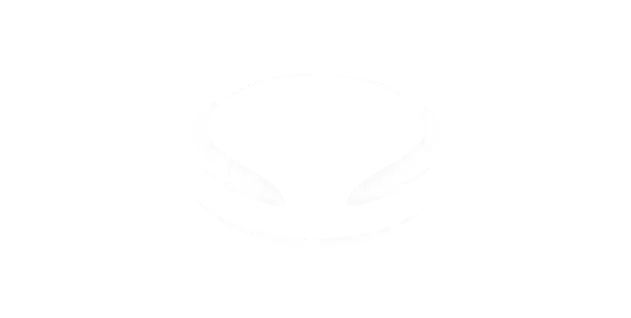
And here is the the Final Result:
B2B
I had the pleasure to conceptualize the logo for the B2B section, based on the established graphic identity: